
The most important employee in your organization is….
Your Website is your most important employee
It is available 24/7 and (hopefully) takes only a few seconds to find and is easy to navigate. It tells your clients where you are, when you are open, how to contact you, what you do, etc. Without it, you have less business.
Doubling Leads Every Year during the Great Recession
During the recession, I became responsible for the website and digital strategy of a company that sold expensive, low-demand products that often required (hard-to-obtain) financing to purchase (custom homes -- what sane person wanted to build a new home during the worst housing market in history?).
The company enjoyed record lead counts during my digital stewardship -- nearly doubling leads year over year.
Don’t Make Me Think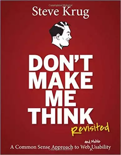
A number of things contributed to this success, but chief amongst them was the advice found in Steve Krug’s book, Don’t Make Me Think: A Common Sense Approach to Web Usability (a new edition has been published since my initial work: Krug, Steve. Don't Make Me Think: A Common Sense Approach to Web Usability. 2013. Print.).
In the second edition (2006) [which is what was available to me at the time], in Chapter 2, “How we really use the web”, Mr. Krug presented three “Facts of Life”, to wit:
- We don’t read pages. We scan them.
- We don’t make optimal choices. We satisfice.
- “Satisfice” is explained as a cross between “satisfying” and “sufficing”
- We choose the first reasonable option.
- We don’t figure out how things work. We muddle through.
He ends the chapter with the following:
If your audience is going to act like you’re designing billboards, then design great billboards.
The home page of your website is a billboard.
The application of this with respect to evaluating designs is to load a page, take off your glasses, walk to the opposite side of the office and see if you instinctively know the answer to the question: “What do I do next?”
Early this morning, I hit the website home page of five (5) custom home builders (three that I knew from my previous life and two that won organic search -- ironically the search winners were not the ones that were economically most successful/dominant a year ago). I turned on the “NoCoffee” Chrome extension, used it to blur the pages and scaled to a laptop-width screen.
Here are the results:

The red ovals represent things that look like they may be clickable and answer the question: “What do I do next?”
Guests come to a website with an objective. The home page is normally the starting point. On a scan level, a user must be able to quickly find the desired information. Otherwise, the user will abandon the site, return to the search engine and visit the competition. An SEO fact that seems to escape most marketers and website designers is that Google measures the rate at which users return to search after visiting a site -- if users quickly return to Google and then go visit another link, your search ranking will be lowered for that query! A slow and/or difficult-to-use site will steadily lose search rank. Your business will suffer as a result.
Of the sites in the image above,
- Site #1 - I have no clue what behavior the designer wants from the user. Is the goal to force menu usage or scrolling? Both are bad UX strategies. See "The Fold Manifesto: Why the Page Fold Still Matters." The Fold Manifesto: Why the Page Fold Still Matters. Web. 11 Apr. 2016. and Wroblewski, Luke. "Obvious Always Wins." LukeW Ideation Design. Web. 11 Apr. 2016. The site needs clear CTAs above the “fold”.
- Site #2 - Obvious call to action (CTA) dead center. It looks like it might require some typing and could benefit from more visual contrast/pop. Nonetheless, it is obvious what the designer thinks the user wants to do next.
- Site #3 - Three (3) CTAs. This may or may not be better. Two of the buttons may be “below the fold” for many users. Buttons are less frictional, but now the user needs to read each one to figure out which one of the buttons is appropriate.
- Site #4 - The CTAs match the site theme and blend in. It took slight thought to find them -- the colors should be adjusted.
- Site #5 - No clear CTA. The menu is red! Why? I guess they want me to think… ...or go to a competitor’s site.
In 2006, mobile web usage wasn’t really a concern. The web was awful on phone-sized screens.
The world has changed a lot since then.
150 times per day with an average duration of 1 minute and 10 seconds
We check our mobile phones 150 times per day and the average mobile session is one minute and ten seconds (1:10min) long (see Adams, Laura, Elizabeth Burkholder, and Katie Hamilton. "Micro-Moments: Your Guide to Winning the Shift to Mobile." Think with Google. Nicolas Darveau-Garneau, Lisa Gevelber, Matt Lawson. Web. 11 Apr. 2016.)
Adams et al. argue that to succeed in a mobile world, sites need to
- Be there
- Be useful
- Be quick
Intent Rich
Mobile usage is “intent-rich” (see "How Micro-Moments Are Changing the Rules." Think with Google. Web. 11 Apr. 2016.). To win on the small screen, your site needs to more than have an obvious CTA. It needs to have obvious quick paths to information.
4 New Moments
There are four new moments every marketer should know (see "4 New Moments Every Marketer Should Know." Think with Google. Web. 11 Apr. 2016.):
- “I want to know” moments
- “I want to go” moments
- “I want to do” moments
- “I want to buy” moments
Consider the following blurry home page:

It appears that there are blue buttons with graphical images for location, hours button, ??? & pictures and a red button (probably an RFI CTA). This website home page feels frictionless and easy to use. At a glance, “know” and “go” seem satisfied. “Do” and “buy” may or may not but it looks there is, at least, a path in this direction.
Conclusion
Your website lets you down. It could do a much better at encouraging prospects to begin the journey down your sales funnel.
Home pages that require thought introduce friction, impede usage and frustrate users. If your competition does a better job on its homepage, odds are good that it will rank better in search, that it will gain more customer eyeballs and that you will lose business to them.
Fix your home page. Sell more.